
Designed in Studio Otwarte.
Design team: Julek Wierzchowski, Patrycja Mola, Oksana Shmygol, Tomek Jurecki, Mirosław Kliś
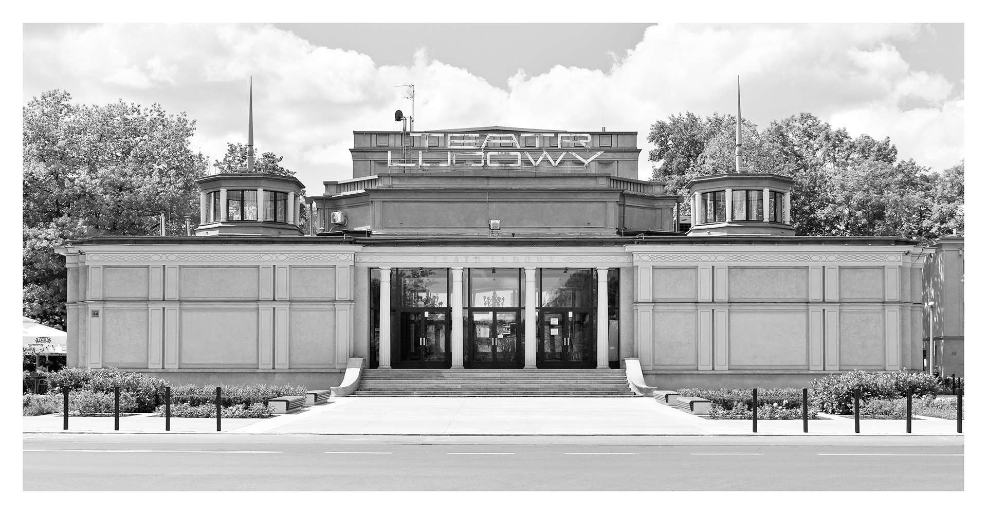
The Ludowy Theatre (literally: People's Theatre, Polish: Teatr Ludowy) is one of the most important contemporary theatres in Krakow, Poland. Its history goes back to the 1950s and creation of Nowa Huta, a large social realist district planned as a center of heavy industry.
Since the beginning Ludowy was closely related to the local community. “Ludowy” literally means “People’s” and can be understood as “Popular” – intended for a broad audience, including the working class population of Nowa Huta. In its current repertoire the theatre has plays for children, young adults and adult audiences. There are both avant-garde plays, defining new directions in Polish theatre, and popular mainstream ones.
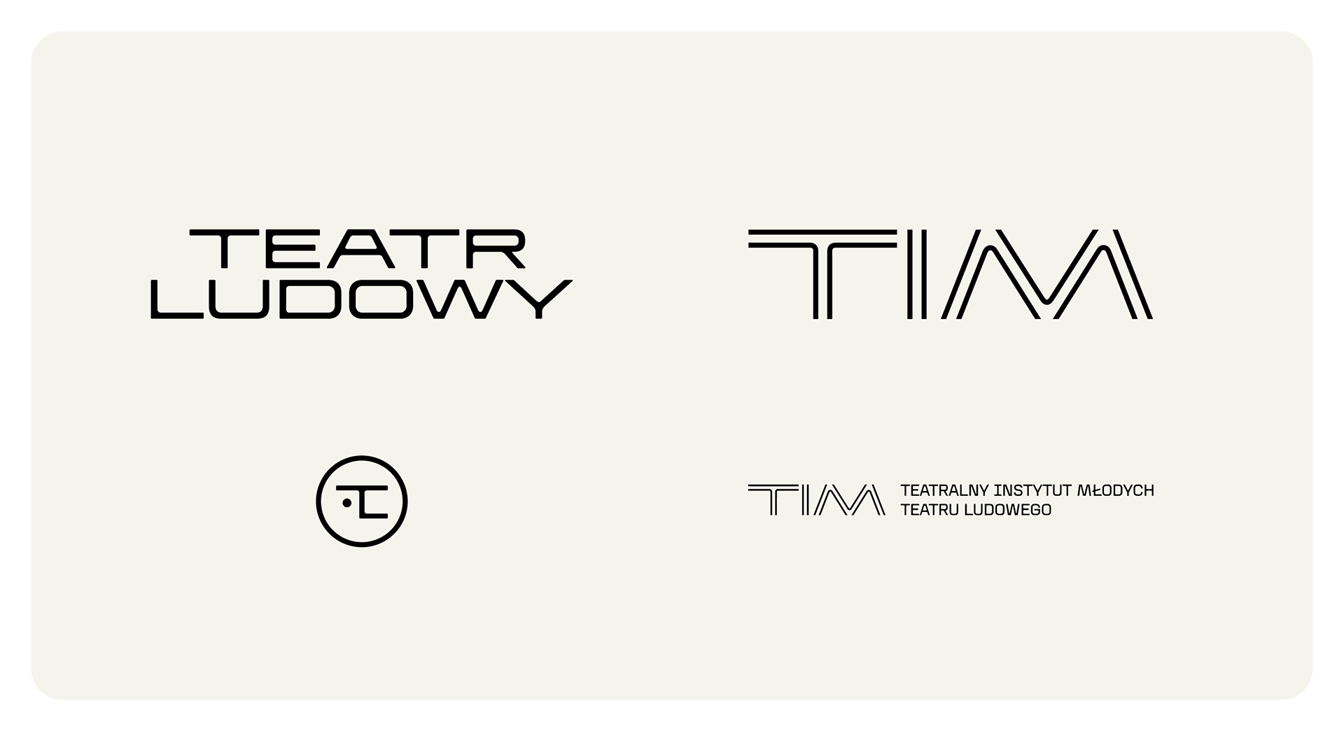
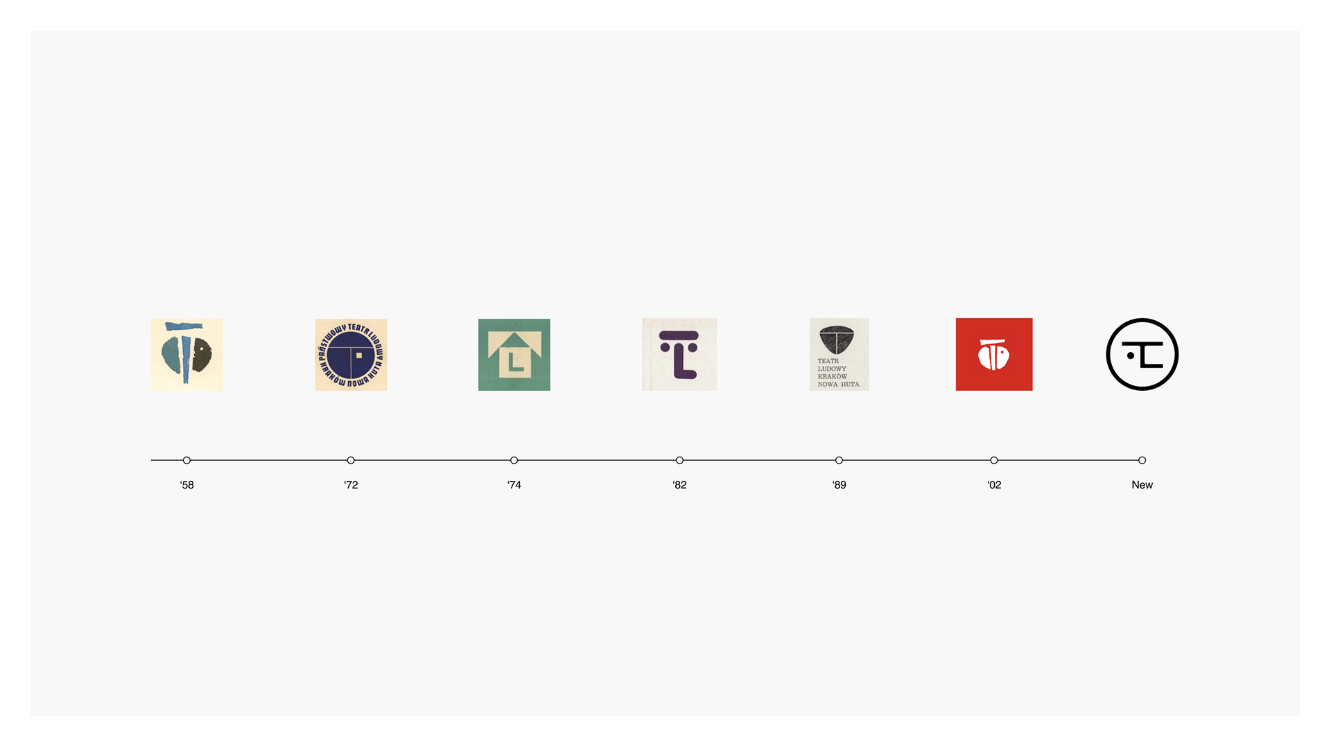
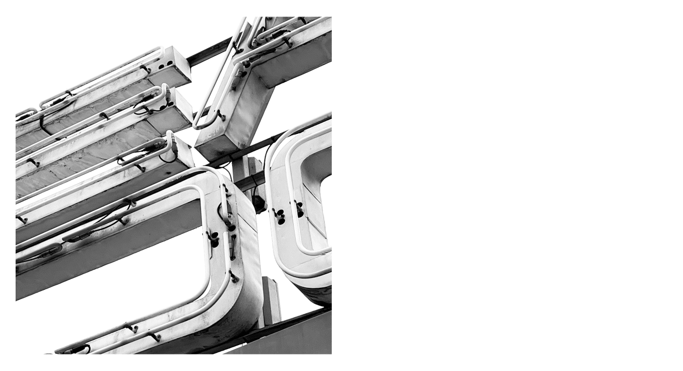
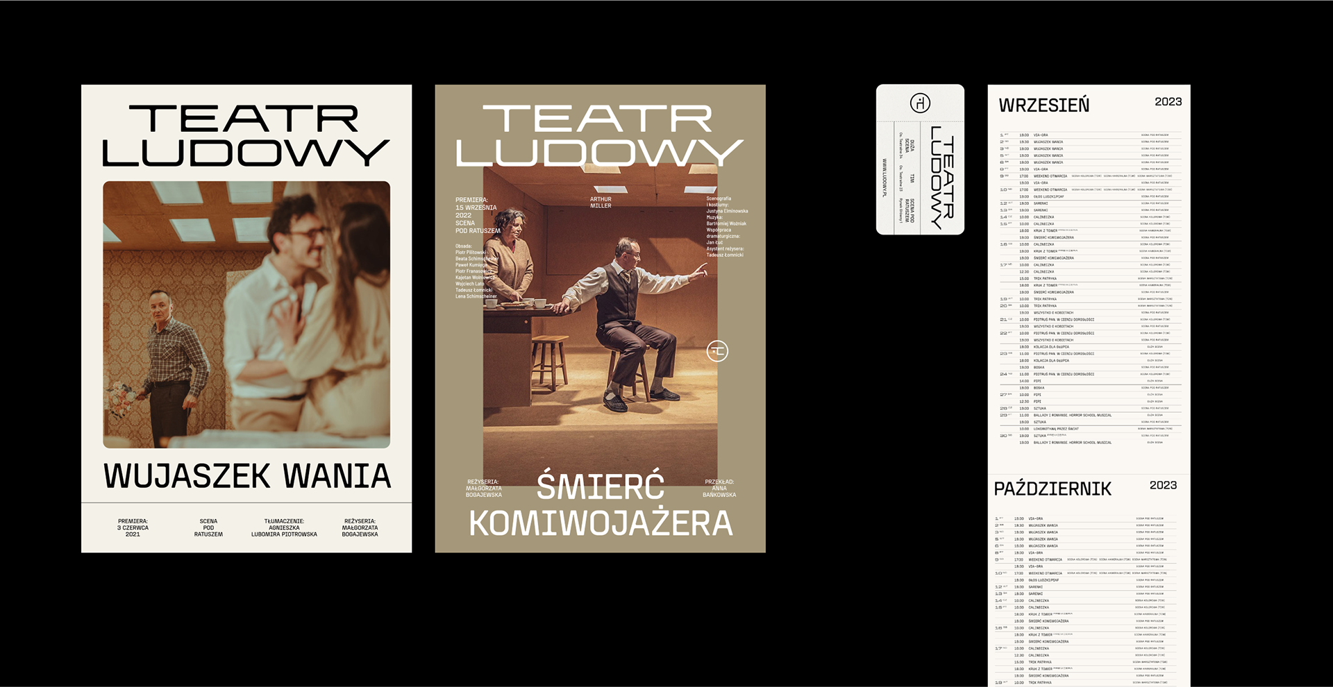
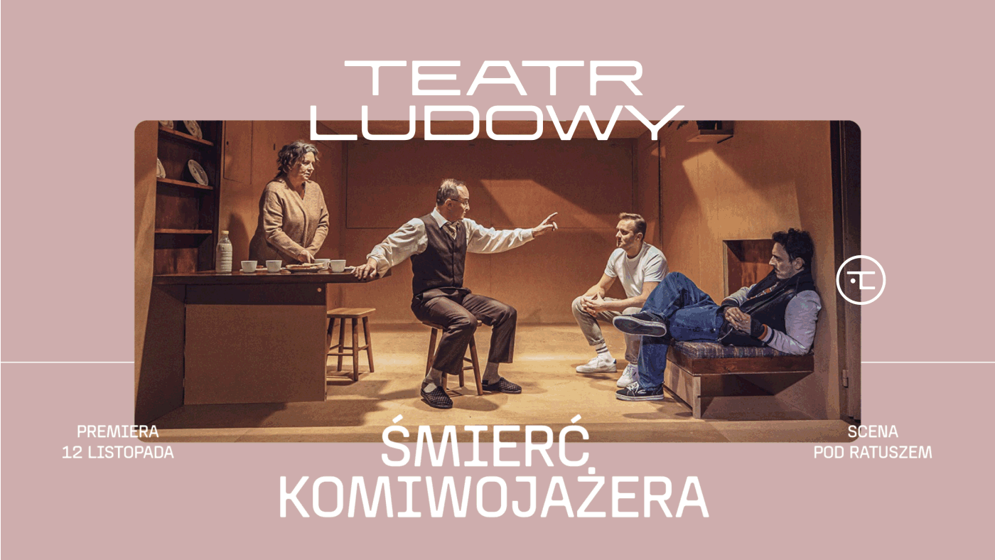
We started our creative process from recollecting the visual history of Ludowy Theatre, analysing historic logotypes, posters, flyers and looking closely at the architectural peculiarities of the theatre building. Social realist architecture and the iconic neon on top of the building became the main inspiration and the base for designing a typeface, which became the core of visual identity system, signage and wayfinding.
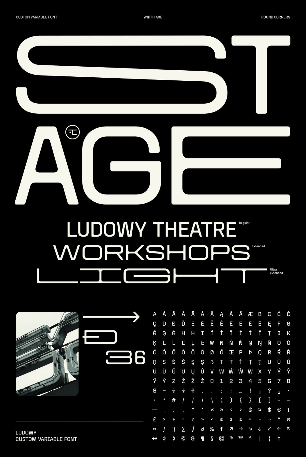
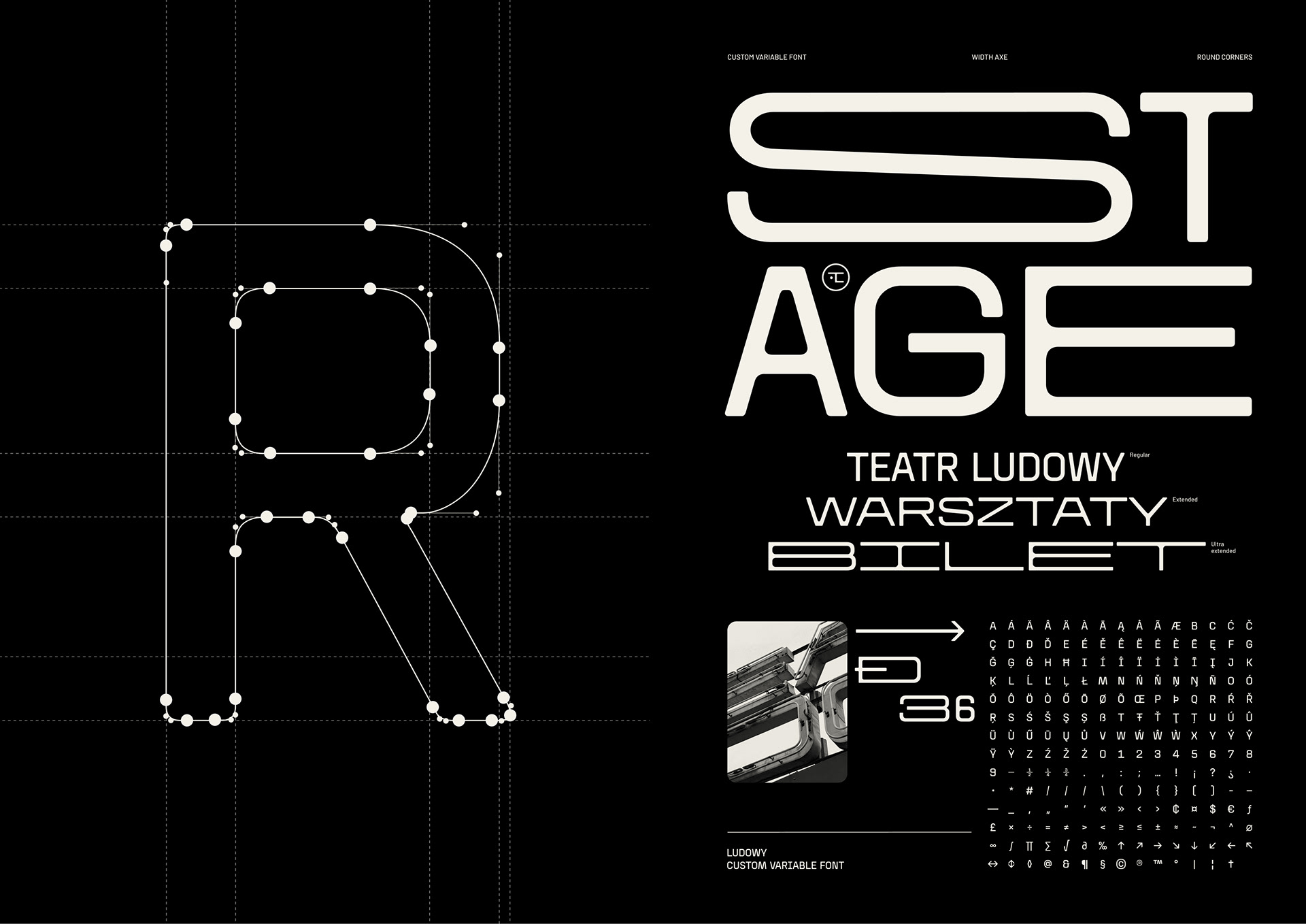
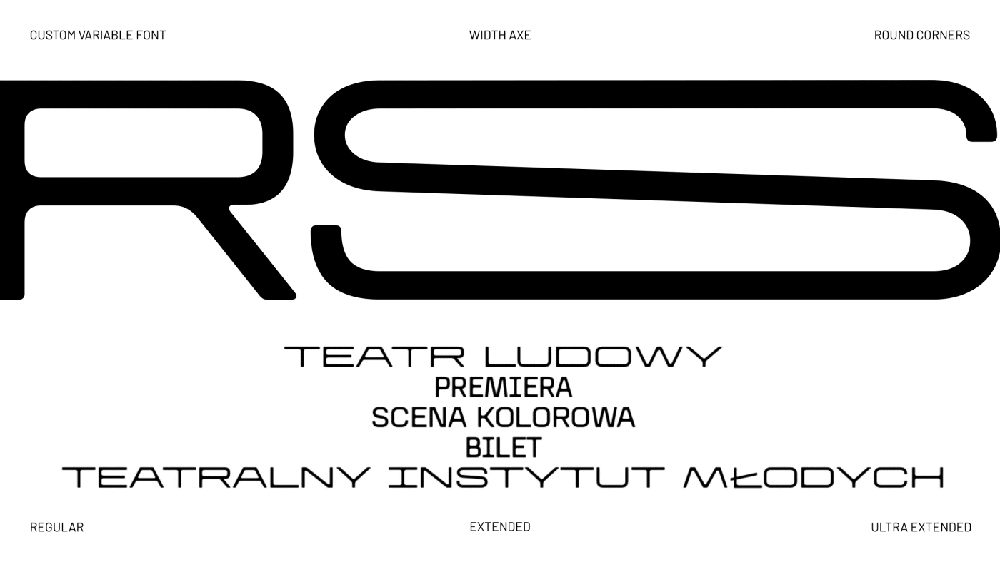
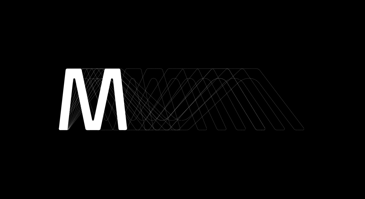
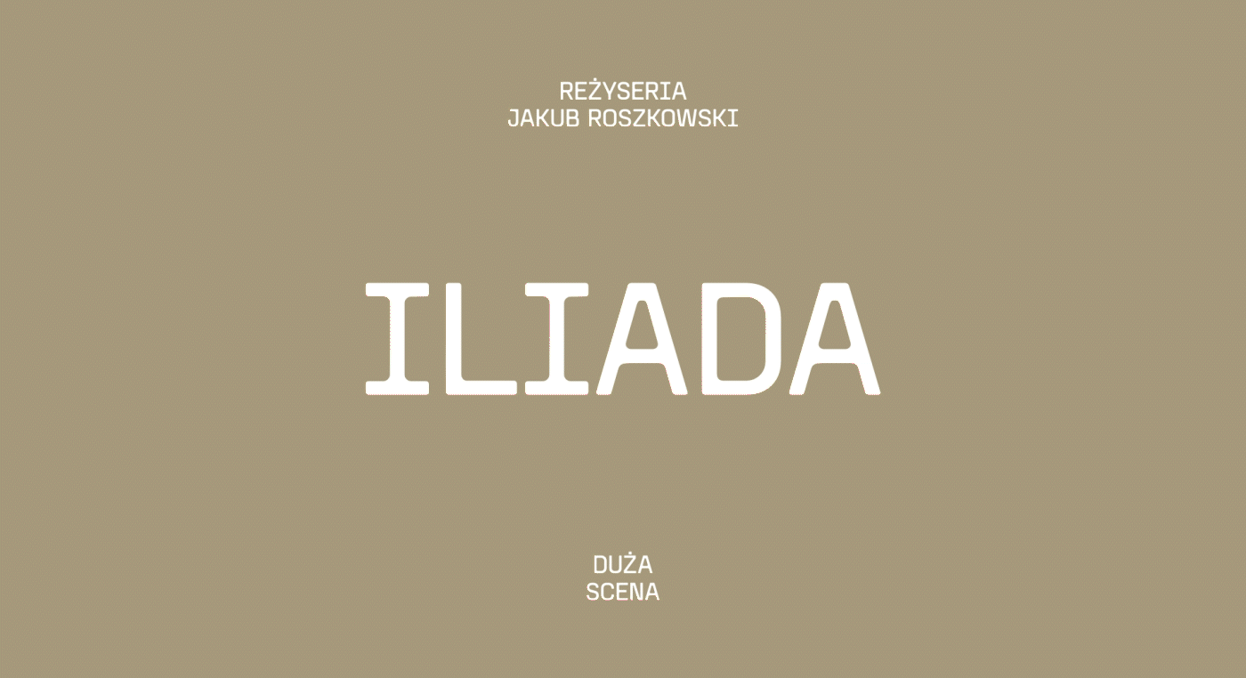
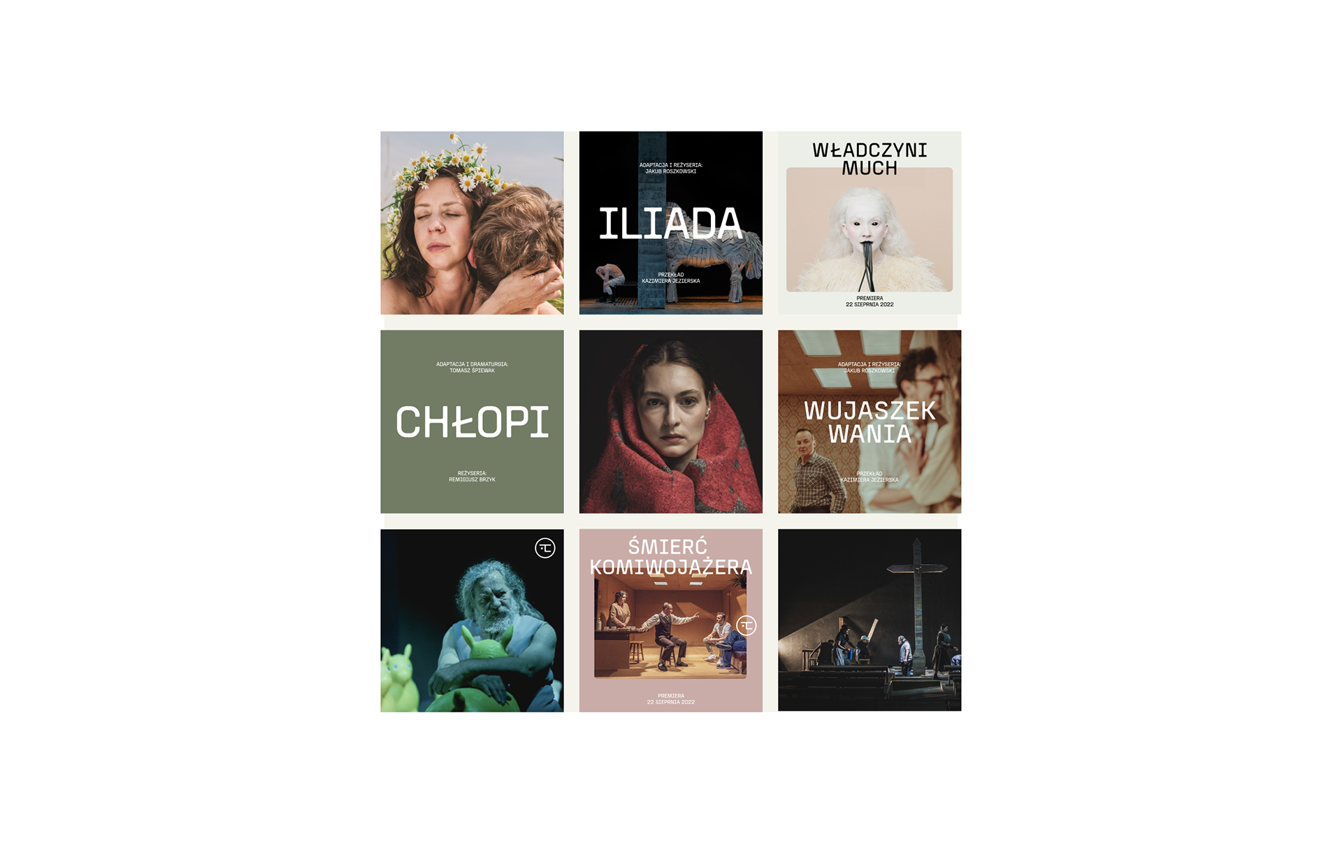
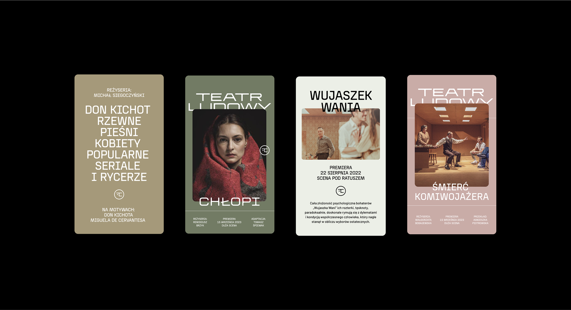
The custom-designed typeface “Ludowy” is a variable font, which makes it possible to change its width depending on the type and length of the text as well as its purpose. It works great when designing for different play name lengths, different occasions, various media: posters, repertoires, as well as animations and social media content.
Since the beginning Ludowy was closely related to the local community. “Ludowy” literally means “People’s” and can be understood as “Popular” – intended for a broad audience, including the working class population of Nowa Huta. In its current repertoire the theatre has plays for children, young adults and adult audiences. There are both avant-garde plays, defining new directions in Polish theatre, and popular mainstream ones.
We started our creative process from recollecting the visual history of Ludowy Theatre, analysing historic logotypes, posters, flyers and looking closely at the architectural peculiarities of the theatre building. Social realist architecture and the iconic neon on top of the building became the main inspiration and the base for designing a typeface, which became the core of visual identity system, signage and wayfinding.
The custom-designed typeface “Ludowy” is a variable font, which makes it possible to change its width depending on the type and length of the text as well as its purpose. It works great when designing for different play name lengths, different occasions, various media: posters, repertoires, as well as animations and social media content.
My scope of work:
design of a custom variable font
key visual developement
digital communication
motion design
printed materials
AWARDS:
Certificate of Typographic Excellence TYPE DIRECTORS CLUB
Gold Award EUROPEAN DESIGN AWARDS
Silver Award EUROPEAN DESIGN AWARDS
Nomination GOLDEN PIN (waiting for results)
Nomination KLUB TWÓRCÓW REKLAMY (waiting for results)